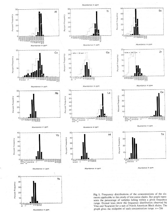
 Figure 1. Frequency distributions of the concentrations of the elements applicable to this study of low-calcic
shales. Bar graph represents the percentage of samples falling within a given frequency range. dotted lines show
the frequency distribution observed by Vine and Tourtelot for a suite of North American Black shales. The graph
gives the midpoint of each concentration range. n=206
Figure 1. Frequency distributions of the concentrations of the elements applicable to this study of low-calcic
shales. Bar graph represents the percentage of samples falling within a given frequency range. dotted lines show
the frequency distribution observed by Vine and Tourtelot for a suite of North American Black shales. The graph
gives the midpoint of each concentration range. n=206